


Dashboard UX design should reduce the distance between a question and a confident action, not display every number the product can calculate.
Imagine a SaaS dashboard with twelve KPIs, seven charts, six filters, and a large table. Stakeholders approved every item. Yet users export the data because they still cannot answer: Which accounts need attention today?
A useful dashboard starts with the user’s role, decision, and next action. It defines metrics, creates hierarchy, chooses honest visualizations, makes filters predictable, supports drill-down, and explains incomplete data.
This guide covers practical dashboard UX design for SaaS, including charts, tables, filters, accessibility, responsive layouts, and AI insights.
Dashboard UX design: the quick framework
A dashboard can support five levels of understanding, though they need not share one screen.
| Layer | User question | Dashboard response |
|---|---|---|
| Status | Is everything okay? | Priority metrics, alerts, freshness |
| Context | What changed? | Trends, targets, baselines, time range |
| Diagnosis | Why did it change? | Breakdowns, filters, drill-downs |
| Detail | Which records are involved? | Searchable, sortable table |
| Action | What should happen next? | Review, assign, contact, resolve, export |

What are best practices for dashboard UX? Begin with a decision, show what supports it, provide context, allow investigation, and connect the result to action. Executives may need status and context; operators often need records and direct actions.
Dashboard UX design starts with decisions, not available data
Ask who uses the dashboard, how often they open it, what they need to know, and what they do afterward. “View revenue data” is not a complete task. “Find which customer segment caused this month’s revenue decline” is closer.
Separate four common jobs:
- Monitoring: Is the system healthy?
- Operational work: What needs action now?
- Analysis: Why did something change?
- Reporting: What must be communicated or exported?
Review interviews, task observation, current reports, support requests, saved views, search and filter logs, and export behavior. If people repeatedly rebuild the same spreadsheet, it may reveal a missing comparison or calculation.
For every proposed metric, ask: If this changes, what would the user do differently? If nobody can answer, it may belong in a report, secondary view, or nowhere.
Strong dashboard UX design follows the user’s decision model, not the database schema or a stakeholder’s KPI wish list.
Dashboard UX design needs role-based views and strong defaults
Executives, managers, analysts, and operators need different depth. An executive may want overall status and exceptions. An operator may need a prioritized queue and direct actions.
Create role-based defaults without turning the product into unrelated experiences. Shared terminology, navigation, filters, and interaction patterns help users move between views.
Entity context matters too. In a hierarchy such as organization, workspace, and site, show clearly where the user is and which data the dashboard includes. Permissions should not leave people inside an empty parent level they cannot understand or access.
Customization can help experts save views, columns, and filters. It should not transfer every prioritization decision to the user. Many people keep the default, so the default SaaS dashboard UI must already support the most common job.
Dashboard UX design begins with defined metrics
A value cannot be trusted when users do not know what it includes. Define each metric’s:
- Plain-language name and purpose
- Formula and unit
- Source and data owner
- Refresh frequency and last update
- Date range and timezone
- Included and excluded records
- Comparison baseline or target
- Handling of missing or estimated data
“Average response: 73” is incomplete. Is that seconds, minutes, or hours? Is it mean or median? Does it cover the last week, selected period, or all time?
Clearly distinguish count, rate, percentage, average, median, target, and forecast. Show whether a comparison is against the previous period, same period last year, plan, or another segment.
If data is delayed or partial, say so near the affected metric. Do not quietly present an old value as current. In trust-sensitive products, link to definitions or data-lineage details without crowding the main view.
Dashboard UX design needs a clear information hierarchy
Arrange information around the user’s attention path: status first, then context, diagnosis, and detail. Use position, scale, contrast, spacing, grouping, and alignment to show relationships.
More emphasis is not always the answer. If every KPI has a colorful icon, badge, border, and chart, secondary decoration competes with the important number. Removing visual noise can improve hierarchy more than making the primary card larger.
Community feedback on dense dashboards often reveals this problem: key metrics sit near the top, but brighter charts pull attention away. Hierarchy depends on the whole screen, not the location of one element.
Use progressive disclosure. Show the summary needed for the first decision, then offer details through expansion, drill-down, or a focused analysis page. “Above the fold” is useful only when it reflects what this user needs first.
Dashboard UX design for charts and tables
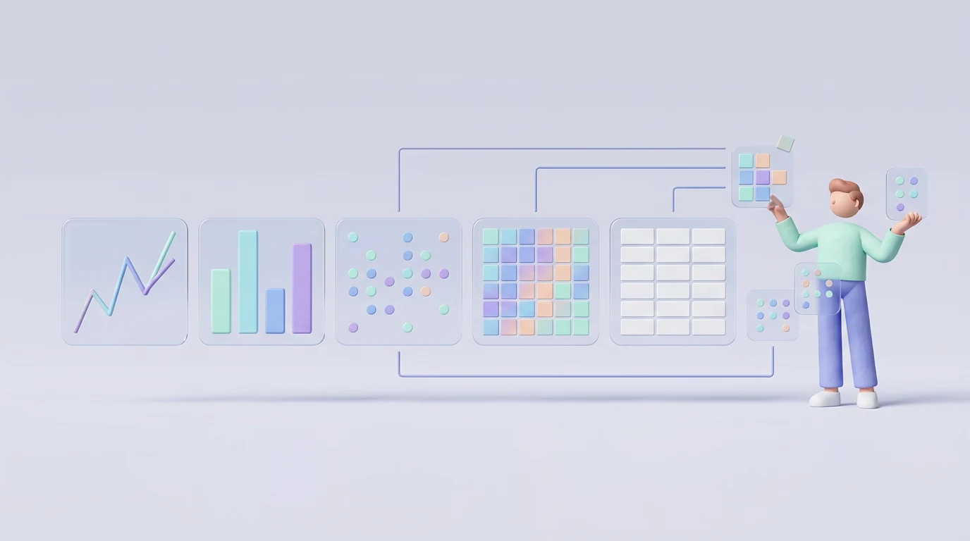
Match representation to the question:
- Line: change over time
- Bar: category comparison
- Stacked bar or area: parts contributing to a total
- Scatterplot: relationship between measures
- Histogram: distribution across ranges
- Heatmap: intensity across two dimensions
- Table: exact values and records
Charts reveal patterns. Tables support precision, many attributes, sorting, filtering, selection, and actions.
Use pie and donut charts carefully because similar angles are difficult to compare. Avoid 3D distortion. Bar charts should usually start at zero; if specialist analysis needs a narrowed scale, explain it. Do not add chart types for variety. Good data dashboard design makes similar questions easy to compare.
Design tables around real tasks
Nielsen Norman Group identifies four common table tasks: find records, compare data, view or edit one row, and act on records.
Place a readable identifier first and keep comparison columns close. Add search, sorting, filters, selection, bulk actions, and row detail where the workflow needs them. Show active sort and filters. Sticky headers or selected columns can preserve context; pagination or virtualization can handle scale.
If rows have parent-child relationships, decide whether sorting should preserve the hierarchy. Flattening may change meaning.
Cards fit visual records with varied content. Tables fit dense repeated attributes. On narrow screens, prioritize columns or open a focused record view rather than squeezing every cell.
Dashboard UX design filters must show their scope
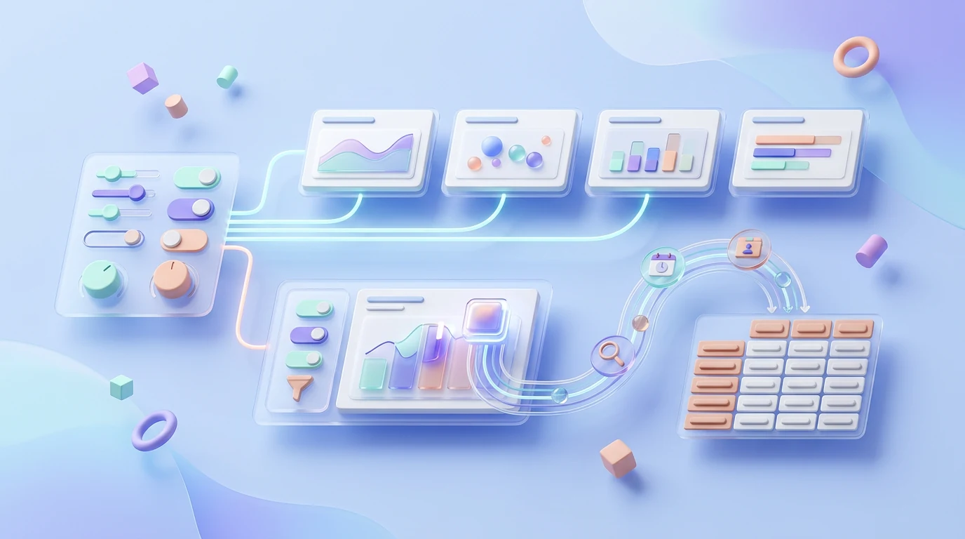
Separate global, section, chart, and advanced filters. Place each filter near the content it controls. If a date filter updates four charts but not two, it is not truly global; group affected views, move it locally, or explain the exception.
Show active filters, date range, entity scope, result count, and reset. Dependent filters should explain unavailable combinations rather than silently return nothing.
Preserve useful state during a session. Distinguish saved and temporary views, and define refresh behavior. When collaboration requires reproducibility, a shared link or export should retain the same scope where privacy allows. Frequent filters should remain discoverable; rare controls can use progressive disclosure.
Connect overview, drill-down, and action
A useful flow often moves from dashboard overview to focused analysis and then record detail. Preserve date range, filters, entity, and navigation context during that transition.
Tooltips can provide exact supplemental values without leaving the chart. Do not hide required explanations or essential actions behind hover, especially when touch and keyboard users need access.
Make chart interactions consistent. If clicking one bar filters the page while another opens a report, the interface must communicate the difference.
Connect an anomaly to a useful next step: review failed payments, assign overdue work, contact an account, inspect affected records, or export evidence. A dashboard that only reports numbers may not support the actual job.
Nielsen Norman Group’s guidance for complex applications recommends easing transitions between primary and secondary information while preserving context. That principle is especially relevant to analytical workflows.
Use color and visual emphasis honestly
Reserve strong color for meaning and priority. If every chart uses a bright palette, nothing feels important.
Keep category and status colors consistent. Do not rely on red and green alone; use labels, shape, patterns, icons, or position as additional cues. Check text, lines, data points, focus indicators, and selected states for sufficient contrast.
Test the dashboard in grayscale. Relationships that disappear without color need another cue. Avoid gradients, shadows, illustrations, and decorative icons that compete with the data.
Color should help users find differences, states, and exceptions. It should not make the SaaS dashboard UI resemble a collection of unrelated marketing cards.
Design loading, empty, error, stale, and partial states

Design more than the populated success state:
- Loading and progressive rendering
- First-use empty state
- No results after filtering
- One failed widget
- Entire dashboard failure
- Stale or delayed data
- Partial source availability
- Permission restriction
- Refresh and recovery
A first-use empty state may guide setup or data connection. A filtered zero-result should preserve filters and help users broaden them. These are different situations.
When one source fails, keep unaffected areas usable and identify which views are incomplete. Show what is known, what is missing, when data was last current, and whether retry is safe.
Never leave a blank card or silently reuse outdated data. Trust depends on explaining the state of the evidence, not only the metric.
Make dashboard UX design accessible
Keyboard users should be able to reach filters, tables, menus, chart controls, drill-downs, and actions in a logical order with visible focus.
Important charts need meaningful labels, units, legends, and a text summary or accessible data alternative. A screen reader cannot interpret a visual trend without equivalent structure. Updates after filtering or refreshing should be announced appropriately.
Do not require hover for essential values. Support zoom and text resizing, use adequate contrast, add non-color cues, and avoid flashing or unnecessary motion. Dense tables need understandable headers and relationships.
Automated tools can find some problems, but they cannot confirm that someone using assistive technology can investigate a metric and act. Test priority dashboard UX design tasks with keyboard and screen-reader users.
Design responsive dashboards by reprioritizing
Responsive design does not mean stacking every desktop card into a very long phone page. Mobile users may need status, urgent alerts, and a few actions rather than deep analysis.
Decide which information survives at each width. Simplify charts, prioritize table columns, enlarge controls, and replace hover with tap-accessible detail. Preserve the active entity and filter state.
Test tablet, narrow laptop, split-screen, zoomed desktop, and phone layouts. A field worker may rely on mobile, while an analyst may never use it for serious investigation. Research the context before building every capability twice.
The mobile app UX design guide covers touch, accessibility, performance, and interrupted use in more detail.
Treat performance and data freshness as UX
Load the status and controls needed for the first decision before secondary detail. Avoid layout shifts that move cards while users scan or click.
Work with engineering on caching, query design, progressive loading, pagination, and virtualization. Test real record counts and slow connections, not only a small sample dataset.
Show refresh time and status where freshness affects decisions. Manual refresh can help in operational views, but it should not hide an unreliable update model. Prevent filters from triggering duplicate or excessively expensive requests.
A fast dashboard with incorrect data is dangerous. A correct dashboard that feels frozen is frustrating. Performance, freshness, and trust must be designed together.
Use alerts, forecasts, and AI insights carefully
An alert needs a threshold, severity, owner, timing, next action, and a way to understand or dismiss it. If every change generates an alert, important conditions disappear into noise.
Forecasts should distinguish predicted values from actual results. Show the timeframe, uncertainty, and enough method context for the audience to judge the output.
AI summaries can identify possible patterns or explain a view in plain language. They should cite the underlying metrics and selected scope so users can verify the statement. Do not present a generated explanation as a confirmed cause.
Conversational queries can help exploration, but stable views remain useful for repeated decisions, shared definitions, and auditability. Apply the same role permissions, privacy controls, and data boundaries to generated answers.
Test dashboard UX design with decisions and real data
Use realistic labels, units, outliers, missing values, long names, roles, large record counts, and delayed sources. Perfect samples hide failures.
Give decision-based tasks: “Which region needs investigation, and why?” is better than “Find the revenue chart.” Observe interpretation, confidence, wrong conclusions, time, filtering, drill-down, and action.
Combine usability tests with analytics, search and filter logs, exports, support issues, and interviews.
If you ask how do I design a clear SaaS dashboard, follow this sequence:
- Define the user and decision.
- Verify metrics and data.
- Structure status, context, and detail.
- Choose the simplest useful representation.
- Connect insight to action.
- Test with realistic tasks.
A wider UI/UX design process keeps visuals from getting ahead of requirements.
Dashboard UX audit checklist
Purpose and data
- Priority user and decision are clear
- Metrics have definitions, units, sources, timeframes, and owners
- Baselines, freshness, partial data, and estimates are visible
Structure and interaction
- Status, context, diagnosis, detail, and action have hierarchy
- Charts match the question; tables support record tasks
- Filter scope, active state, and sorting are visible
- Drill-down preserves context
Quality and trust
- Color is not the only cue
- Loading, empty, zero-result, stale, and error states exist
- Keyboard, screen-reader, zoom, and responsive paths work
- Performance holds with realistic volume
- Alerts, forecasts, and AI outputs expose basis and uncertainty
- Research and product evidence guide iteration
Common SaaS dashboard mistakes
- Showing every available metric
- Designing one generic view for every role
- Displaying values without units, dates, or baselines
- Choosing charts for visual variety
- Hiding exact data that belongs in a table
- Using global filters that affect only some widgets
- Losing filter context during drill-down
- Making decorative color louder than the insight
- Ignoring empty, stale, partial, and error states
- Relying on hover for essential interaction
- Shrinking desktop layouts onto mobile
- Testing only with perfect sample data
- Adding AI explanations without verifiable evidence
Most poor dashboards are not short of components. They are short of priority, context, and a clear path from information to action.
Frequently asked questions
What are best practices for dashboard UX?
Design around decisions, define metrics, build hierarchy, use honest charts or tables, support filters and drill-down, show data states, and test realistic tasks.
What should a SaaS dashboard include?
Only the status, context, records, and actions needed by the priority role. Put secondary analysis behind drill-down.
How do I design a clear SaaS dashboard?
Start with one decision, verify data, arrange status to detail, choose a useful representation, add the next action, and test interpretation.
Should dashboards use charts or tables?
Charts reveal patterns. Tables support exact values, comparison, record finding, editing, selection, and actions. Many products need both.
How many KPIs should a dashboard show?
There is no universal number. Keep only metrics needed for the first decisions.
Where should filters go?
Global filters belong at dashboard level; local filters sit near affected content. Always show scope and reset behavior.
How can a dashboard be accessible?
Provide keyboard access, focus, labels, units, non-color cues, summaries, data alternatives, zoom support, and assistive-technology testing.
Final recommendation
The best dashboard UX design does not show the most data. It helps a specific person move from a question to a sound decision and useful action.
Start with roles, decisions, and metric definitions before choosing charts. Preserve context through filters and drill-down, explain every data state, and test with real complexity.
If your SaaS dashboard has plenty of data but little clarity, explore Imdshakil’s SaaS Application Design service or discuss your dashboard project.

