


Mobile app UX design succeeds when people can complete an important task without fighting the interface. A polished mockup is not enough if the keyboard hides errors, the main action is hard to reach, or progress disappears when the connection drops.
A good mobile experience feels focused, predictable, responsive, and forgiving. It works with fingers rather than a cursor, respects the way iOS and Android behave, supports people using assistive technology, and handles interruptions without losing their work.
The best improvements are rarely decorative. They come from clarifying the main task, removing unnecessary steps, showing useful feedback, and testing the real product on real devices.
This guide covers practical mobile app UX design decisions for navigation, onboarding, permissions, forms, accessibility, performance, offline behavior, and post-launch improvement.
Mobile app UX design: the quick checklist
Before redesigning every screen, walk through the app as a first-time user and ask:
- Is the app’s purpose clear within the first few moments?
- Can users reach the first useful result without a long explanation?
- Are important actions comfortable to reach and tap?
- Does navigation behave predictably?
- Can users recover from form mistakes?
- Are loading, empty, error, offline, and success states designed?
- Does larger text fit without hiding content or controls?
- Can core tasks work with VoiceOver or TalkBack?
- Are permissions requested when their value is clear?
- Has the built app been tested on ordinary phones and slow networks?
| If users struggle with… | Inspect first |
|---|---|
| First-session drop-off | Onboarding, signup, permissions, and time to first value |
| Features that feel hidden | Navigation, labels, hierarchy, and role-based access |
| Repeated wrong taps | Target size, spacing, reach, and overlapping controls |
| Form abandonment | Field count, keyboard choice, validation, and error recovery |
| “Nothing happened” reports | Loading, success, disabled, and offline feedback |
| Poor retention | Core value, reliability, notifications, and repeated-task speed |
A checklist can reveal symptoms, but it cannot explain why they happen. Observe users completing the task before deciding on a fix.
What mobile app UX design actually includes
Mobile app UX design covers the complete experience of reaching a goal on a phone or tablet. It includes the user’s context, task flow, information structure, touch input, system feedback, performance, accessibility, privacy, interruptions, and recovery.
UI is the visible and interactive layer: typography, colors, spacing, icons, buttons, fields, cards, and motion. Strong mobile UI best practices support the flow, but attractive controls cannot repair an unnecessary signup or an unreliable payment process.
A desktop screen also cannot simply be reduced until it fits a phone. Mobile users may be walking, holding the device with one hand, switching networks, using larger text, or returning after an interruption. The interface must decide what matters now and what can wait.
1. Design around one clear user goal
Start with the main reason someone opens the app. In an expense app, that might be capturing a receipt. In a delivery app, it could be checking an order. Make that task visible and remove choices that delay it.
Secondary features can remain available without competing for attention. If roles differ, show each role the actions it needs instead of placing every option in one menu. Clear priorities make mobile app UX design feel simpler without removing useful capability.
2. Make navigation predictable
Good mobile app UX design helps users understand where they are, the main destinations, and what Back will do. Use familiar platform patterns for tabs, app bars, hierarchy, and navigation history. Add labels when an icon is not universally understood.
Preserve context after users open an item and return. Avoid sending them to the top of a long feed or resetting filters without warning. For complex role-based products, organize navigation around frequent tasks and permissions rather than exposing a flat list of every screen.
3. Design for fingers, reach, and accidental taps
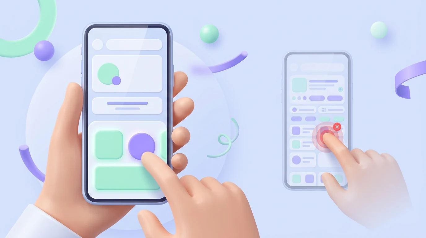
A finger is less precise than a pointer. Give controls enough target area and space so nearby actions are not triggered by mistake. Material guidance uses a 48 by 48 dp minimum target for interactive elements in its components. Apple guidance varies by platform and control, so follow the current native recommendations.
Keep frequent actions within comfortable reach where practical. Do not make a tiny icon the only tappable area, and separate destructive actions from routine controls. Test with different hands and devices rather than trusting a desktop prototype.
4. Use gestures as shortcuts, not secrets
Swiping, dragging, pinching, and long-pressing can make experienced use fast. They should not be the only way to complete an essential action.
Provide visible alternatives for deletion, navigation, reordering, or revealing controls. Make gestures consistent and consider right-to-left languages, motor limitations, screen readers, and accidental input. In onboarding, visible Back and Next controls are often clearer than relying only on swipes and page dots.
5. Keep onboarding focused on the first useful result
In mobile app UX design, onboarding should help users reach value rather than explain every feature. A task manager might guide someone to create one useful task. A finance app may need identity and consent before showing account data. The right flow depends on what must happen before the product can work safely.
Let people preview the app before registering when possible. If signup, profile details, or permissions are necessary, explain why and ask only for what is needed now. Contextual tips and helpful empty states usually teach better than a long slideshow shown before users understand the interface.
Allow optional steps to be skipped. Save completed setup and return people to a sensible point if they leave midway. Coach marks should support a real action and remain available long enough to be understood; do not let important instructions disappear on a short timer.
For a deeper approach to first value, read Imdshakil’s SaaS onboarding design guide.
6. Ask for permissions in context
Do not request notifications, location, contacts, photos, and camera access immediately after launch. Ask when the person chooses a feature that needs the permission and explain the benefit in plain language before the system prompt when useful.
Design for refusal. The app should remain useful where possible, explain which feature is limited, and show how access can be enabled later. Never shame users into consent or imply that optional access is mandatory.
7. Reduce form and authentication friction
Ask only for information required at that stage. Use the right keyboard, autofill, password-manager support, passkeys where appropriate, persistent field labels, and formats that accept reasonable variations.
Validate after users have had a fair chance to complete a field. Put a specific error near the problem, announce it to assistive technology, and ensure the keyboard does not hide it. Preserve entered data after a network issue or interruption.
Long regulated flows may need progress, save-and-return support, and clear explanations. Splitting a form into screens does not make it shorter; remove unnecessary questions before changing its presentation.
8. Design every system state
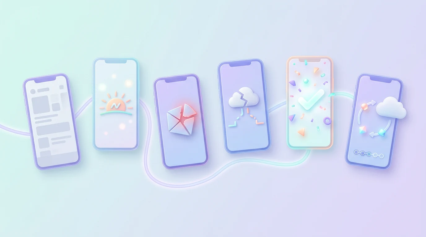
Most app mockups show a perfect account with data and a reliable connection. Users judge the product when reality is less convenient.
Design loading, empty, zero-result, error, offline, partial, success, denied-permission, and expired-session states. Each should explain what happened and provide the next safe action. Avoid blank screens and endless spinners.
Show whether work is saved locally, waiting to sync, or confirmed by the server. A friendly illustration is not recovery unless the user can continue.
9. Make performance part of the experience
A visually simple app can still feel poor when taps respond late or content jumps while loading. Prioritize responsive touch feedback, stable layouts, progressive loading, optimized media, and fast access to the main task.
Use animation to explain change, not delay it. Test startup and common flows on older devices, low battery, limited storage, and slow connections. One universal speed number will not describe every app, but users should never wonder whether their tap worked.
10. Support poor connections and interruptions
Decide what people can read, create, queue, or save without a reliable connection. Preserve progress when the app closes, a call arrives, or the network changes.
Explain pending sync and conflicts without technical language. Never show success for an irreversible action before it is confirmed. Make retry safe so a second tap does not create a duplicate order, payment, upload, or message.
Reliable recovery is an important mobile app UX design advantage because real sessions rarely happen under perfect test conditions.
11. Build accessibility into the normal workflow

Accessibility is a normal part of mobile app UX design, supporting many ways of seeing, hearing, understanding, and controlling an app. It also helps people using a phone in bright light, without sound, with one hand, or under stress.
Support text resizing, sufficient contrast, non-color cues, clear labels, logical focus, reduced motion, captions, and alternatives to complex gestures. Use native controls when they fit because they often include familiar behavior and accessibility support, but still test them.
A custom control must expose its name, role, value, state, and available actions. Carousels should not trap screen-reader focus or require dozens of swipes to escape. When text becomes larger, content must reflow rather than overlap or disappear.
Test core tasks with iOS VoiceOver and Android TalkBack. Include keyboard or switch access where relevant. Apple’s accessibility guidance recommends interfaces that are intuitive, perceivable, and adaptable, and it encourages accessibility audits during design.
Automated checks can find some contrast, label, and target problems. They cannot prove that a disabled person can complete the task comfortably. Include people with disabilities in research and testing instead of treating accessibility as final QA.
12. Respect iOS and Android conventions
A product can keep one brand while adapting behavior to each platform. Navigation, back behavior, permissions, typography, controls, safe areas, and system settings do not need to look or work identically.
Follow Apple Human Interface Guidelines and Material Design as living references. Native patterns give users familiarity and often provide useful accessibility behavior. Avoid copying a new visual effect simply because it is fashionable; first check legibility, performance, and whether it supports the task.
13. Use clear visual hierarchy and content
Give each screen a clear purpose and an obvious primary action where practical. Use readable typography, consistent spacing, strong grouping, and contrast that separates interactive controls from information.
Among the most useful app design tips is writing specific action labels. “Save address” is clearer than “Submit.” Keep labels visible when users type, and write error and empty-state messages that explain how to continue. Icons should support meaning rather than replace necessary words.
14. Protect trust around notifications, AI, and personal data
Notifications should be relevant, controllable, and linked to the exact place where a user can act. Do not ask for notification access before showing why alerts would help.
Explain when AI is generating, changing, or summarizing content. Let users review and correct important results, especially before an irreversible action. Be clear about sensitive data use and provide understandable controls.
Avoid false urgency, disguised ads, forced permissions, confirmshaming, and confusing subscription choices. Short-term conversion tricks often create long-term distrust.
15. Test on real devices and improve after launch

Strong mobile app UX design requires testing critical flows as prototypes and then testing the built app. Real devices reveal keyboard behavior, safe-area problems, touch issues, permissions, loading, haptics, text resizing, battery use, and network failures that polished frames cannot show.
Use different screen sizes, operating-system versions, device performance levels, orientations, accessibility settings, and connection conditions. Combine analytics with interviews, usability sessions, app-store reviews, support messages, and observed behavior.
If you are asking how do I improve UX on my mobile app, use a focused loop:
- Find the high-value task people fail to complete.
- Observe where and why it fails.
- Fix the smallest root cause rather than redesigning everything.
- Validate the change before expanding the scope.
Measure task success, time to first value, recovery, form completion, drop-off, retention, and accessibility. A higher tap count is not automatically improvement.
For research, prototyping, and analytics options, see the guide to UX tools for startups.
Common mobile UX mistakes
- Shrinking desktop layouts onto phone screens
- Showing a long tour before any value
- Forcing signup without a clear reason
- Requesting every permission on first launch
- Using tiny or crowded touch targets
- Hiding core actions behind gestures
- Losing filters, scroll position, or form progress
- Forgetting loading, error, denied, and offline states
- Showing form errors behind the keyboard
- Using color as the only status cue
- Making iOS and Android identical where conventions differ
- Testing only on flagship phones and fast Wi-Fi
- Tracking engagement without measuring task success
These mistakes usually come from designing ideal screens rather than complete journeys. A strong SaaS product design process connects user goals, edge cases, testing, and implementation.
Frequently asked questions
What are the best UX practices for mobile apps in 2026?
Focus on the core task, predictable navigation, comfortable touch targets, contextual onboarding, clear system states, accessibility, performance, safe recovery, and real-device testing. Trends matter less than helping people complete useful work.
How do I improve UX on my mobile app?
Start with an important task that users abandon or complete incorrectly. Observe real attempts, identify the root cause, make a focused change, and validate it with users and product evidence.
Should users sign up before seeing the app?
Only when identity, consent, safety, saved data, or required setup makes it necessary. Otherwise, a useful preview can show value before asking for commitment.
How many onboarding screens should an app have?
There is no universal number. Use only the guidance needed to reach first value, and test whether users understand and complete the flow. Some clear products need no introductory slideshow.
Should mobile apps use gestures or visible buttons?
Use gestures as efficient shortcuts, but provide discoverable and accessible controls for important actions. Never make a hidden swipe the only route to a core feature.
How should an app handle denied permissions?
Keep unaffected features available, explain what the denied permission changes, and offer a clear route to settings when the person tries the relevant feature again.
What is the difference between mobile UI and mobile UX?
Mobile UI is the visible interface and controls. Mobile UX covers the full journey, including structure, behavior, input, feedback, performance, accessibility, trust, and recovery.
Final recommendation
The best mobile app UX design makes an important task clear, reachable, recoverable, and accessible under real conditions. Start with the user’s goal, use familiar behavior, design every state, and test the built product beyond the newest phone and fastest network.
Visual polish still matters, but it should support confidence rather than hide friction. If your app has confusing flows, incomplete states, or difficult developer handoff, explore Imdshakil’s Mobile App Design service or discuss your product.

