

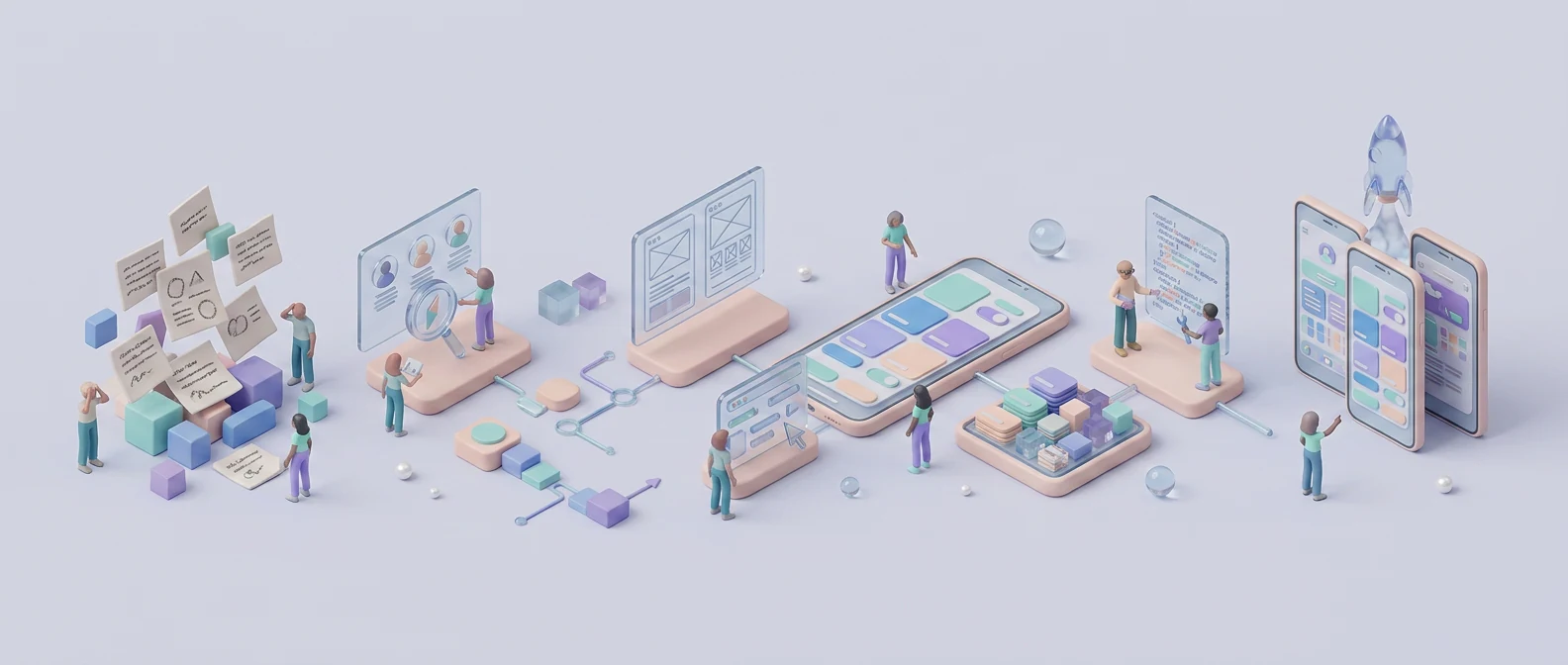
The UI/UX design process turns an unclear product request into something useful, testable, and realistic to build. It is not a straight line from a feature list to polished screens.
Imagine a SaaS founder asking for a new dashboard. The brief includes charts, filters, team roles, exports, and an AI summary. Design starts immediately. Two weeks later, engineering explains that some data is unavailable, nobody agrees on what managers should see, and the approved mockup has no empty or error states.
The visual work was not necessarily bad. The team simply polished unanswered questions.
A practical process moves through alignment, discovery, definition, flows, wireframes, prototypes, testing, visual design, handoff, implementation review, and post-launch learning. These activities overlap and repeat according to risk. The goal is not to create the most documents. It is to reduce expensive uncertainty before and during development.
UI/UX design process: the complete workflow at a glance
The stages below provide structure, but they are not a waterfall. Research may challenge the brief. A prototype may reveal a missing requirement. A developer may identify a technical limit that sends the team back to the flow.
| Stage | Main question | Useful output |
|---|---|---|
| 1. Alignment | What outcome should improve? | Brief, scope, risks, success signals |
| 2. Discovery | What do we know and need to learn? | Evidence, questions, assumptions |
| 3. Definition | Which problem and users come first? | Problem statement, priorities, constraints |
| 4. Structure | How should people move through the product? | Task flows, information architecture, states |
| 5. Wireframes | What belongs on each screen? | Low-fidelity layouts and behavior |
| 6. Prototype | How should the interaction work? | Testable flow |
| 7. Validation | Can users complete the task? | Findings and revisions |
| 8. UI system | How should it look and stay consistent? | Components, styles, responsive screens |
| 9. Handoff | What does engineering need? | Specifications, assets, acceptance criteria |
| 10. Build review | Does production match the intent? | QA decisions and updates |
| 11. Learning | Did the outcome improve? | Evidence and iteration backlog |

A small feature may move through these stages in days. A multi-role financial product may need deeper research, compliance review, and validation. The UI/UX design process should match the cost of being wrong.
UX, UI, and product design are connected but different
UX covers user goals, journeys, information structure, interaction, evidence, accessibility, and task success. UI covers the visible system: typography, color, spacing, controls, components, states, responsive behavior, and motion.
Product design connects those decisions with business goals and technical reality inside the UI/UX design process. That is why separating UX and UI into two isolated handoffs often creates trouble. A visual choice can change usability, while a flow decision affects which components the interface needs.
When people ask how designers work, they may expect a fixed sequence of wireframes, mockups, and prototypes. In practice, designers move between understanding, creating, checking, and communicating. The exact deliverables change, but the team should always know what question each activity is answering.
Step 1 — Align on the problem, scope, and outcome
Start the UI/UX design process by reviewing the product stage, target users, business goal, pain points, platform, technical environment, timeline, and decision-makers. A request such as “add an analytics dashboard” describes an output, not the outcome.
Ask what decision the dashboard should help users make. Identify what is in scope, out of scope, known, assumed, and risky. Agree on success signals such as fewer support requests, faster task completion, or better activation rather than “make it modern.”
Document who can approve product behavior, visual direction, content, and technical changes. Unclear decision ownership can create as much rework as unclear requirements. A short working brief, constraint list, and decision log are often enough to begin.
Step 2 — Run focused discovery and research
Discovery helps the team understand the problem before committing to a solution. Review current analytics, support messages, sales conversations, previous research, product behavior, competitors, and technical documentation. Speak with users and stakeholders where important questions remain.
A new product may need research into existing habits and alternatives. An established SaaS feature may already have useful evidence in search logs, tickets, recordings, and customer calls.
Do not perform every research method by habit. Choose the smallest useful activity for the uncertainty. Nielsen Norman Group recommends teams scale discovery in Agile rather than skip it, focusing on targeted questions and likely assumptions.
At the end, separate facts from assumptions. Summarize what the evidence suggests, what remains unknown, and which unknowns could change the project direction. This keeps the UI/UX design process grounded without turning research into an endless phase.
Step 3 — Define users, jobs, requirements, and priorities
The UI/UX design process turns discovery into a clear problem statement and prioritized user tasks. Define user roles early, especially when administrators, managers, members, and clients need different data or permissions.
Separate several types of input:
- User needs and expected outcomes
- Business requirements and policies
- Functional behavior and rules
- Technical constraints and data availability
- Content and localization needs
- Accessibility, privacy, and compliance requirements
Should requirements or wireframes come first? Initial requirements should describe the problem, outcome, and constraints before a solution is polished. Wireframes then expose missing rules and new questions, so both develop together.
Avoid decorative personas built from guesses. A role or job-based profile is more useful when it reflects evidence and changes a design decision.
Step 4 — Map journeys, task flows, and information architecture
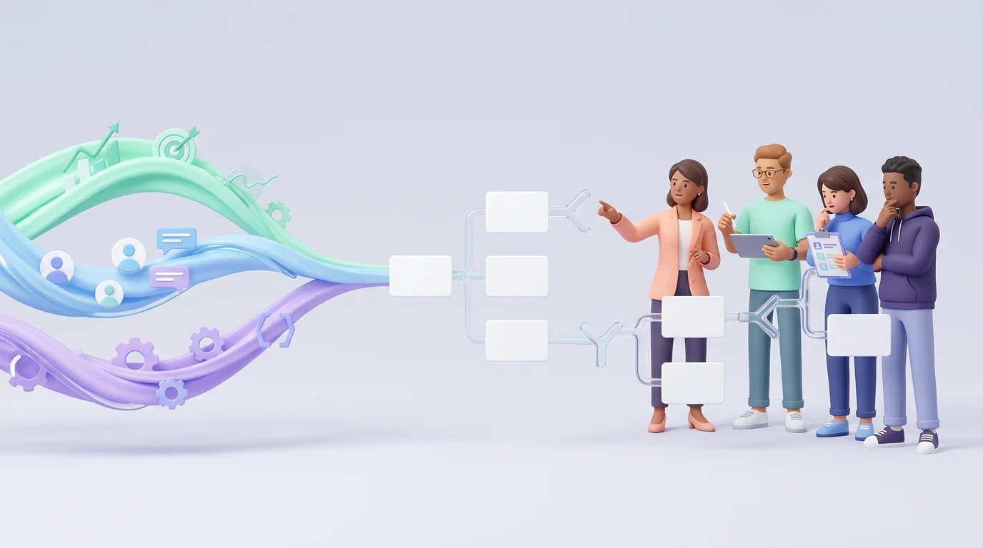
Map how a task begins, the decisions users make, where the system responds, what may fail, and how success is confirmed. Include alternate paths such as denied permission, missing data, expired access, cancellation, and interrupted work.
Information architecture organizes destinations, content, and navigation so people can predict where things belong. For multi-role SaaS products, check what each role can view, create, edit, approve, export, or delete.
Bring engineering into these conversations. A polished dashboard may depend on data the product does not collect. A simple-looking approval flow may require complex permissions and audit history. Finding this now is cheaper than discovering it after UI approval.
Useful outputs include a core task flow, navigation model, and state inventory. Create a journey map only if the wider experience across channels or time affects the decision.
Step 5 — Explore ideas before polishing one
Use sketches, rough diagrams, references, and quick alternatives to explore different ways of solving the problem. Early work should be easy to discard.
Compare directions against user needs, the target outcome, technical feasibility, content, and accessibility. Do not choose solely because one concept looks more impressive in a presentation.
AI can generate layout directions or prototype code quickly, but speed is not validation. Generated work may ignore product rules, edge cases, brand constraints, or accessibility. Treat it as another sketch and keep responsibility for the decision with the team.
Step 6 — Create wireframes that answer structural questions
Within the UI/UX design process, wireframes focus on hierarchy, content, controls, and behavior before styling makes the work feel finished. Use realistic content because placeholder text can hide layout, comprehension, and data-density problems.
Include key responsive changes and system states. A happy-path dashboard filled with perfect data does not explain loading, empty, partial, permission, error, or role-based views.
Are wireframes requirements? They can clarify and reveal requirements, but they should not be the only record of business rules and acceptance criteria. A visual layout cannot fully explain validation, permissions, calculations, or what happens after failure.
Paper sketches may be enough for a simple early discussion. Detailed wireframes help when several roles, screens, and branches must align. Imdshakil’s SaaS product design guide covers the wider connection between product goals, flows, interfaces, and delivery.
Step 7 — Build a prototype at the right fidelity
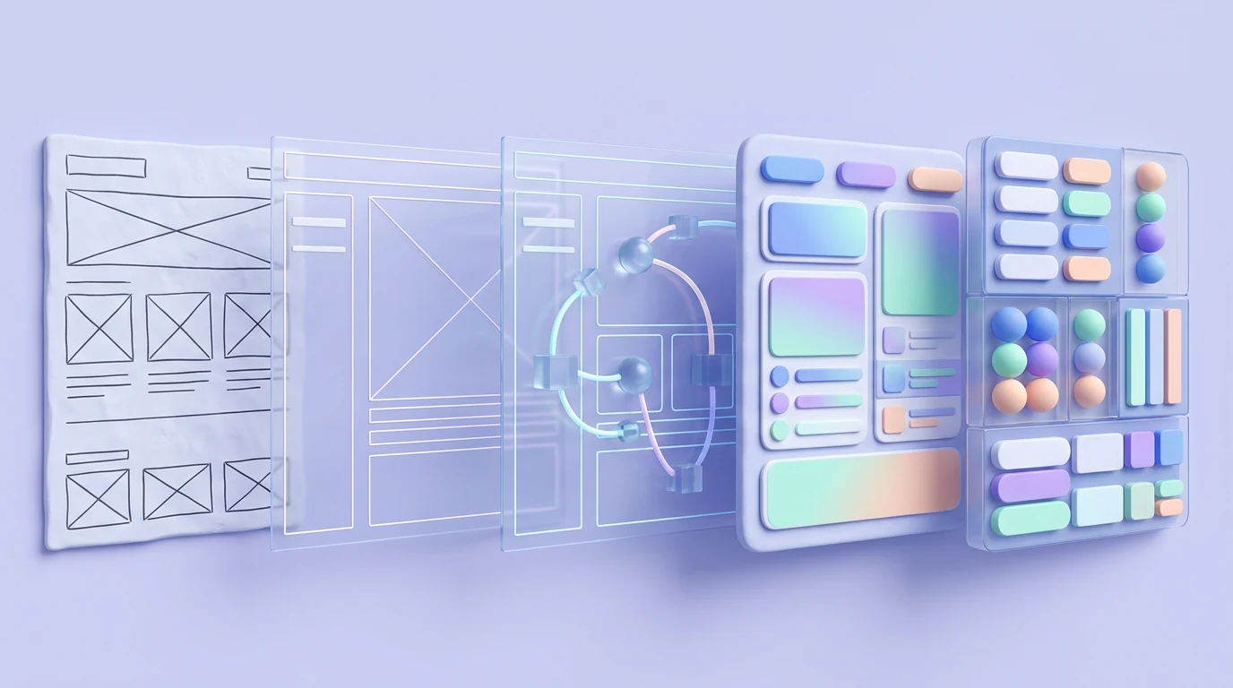
Prototype according to the question. A rough clickable flow can test navigation. A realistic high-fidelity prototype may be needed for detailed interactions, content comprehension, or stakeholder alignment.
Do not prototype every screen simply because the tool makes it possible. Prioritize the uncertain and expensive parts. Include enough real data and interaction to prevent a misleading test.
State the prototype’s limits. It may not reproduce production performance, keyboard behavior, assistive technology, responsive edge cases, or backend rules. A smooth click-through is evidence about the tested flow—not proof that the finished product will work.
Step 8 — Test, learn, and revise
Give suitable users realistic tasks without teaching the intended path. Observe completion, hesitation, wrong turns, expectations, and recovery. What people do often reveals more than whether they say they like the screen.
Separate evidence from preference. One participant disliking a color is different from several participants failing to find the primary action. Prioritize findings by severity, frequency, confidence, and impact on the product outcome.
Record the decision, not only the observation. Note what changed, why it changed, and which risks remain. Then revise the flow or prototype and retest where the change is important.
Testing a low-fidelity structure does not validate every later visual and interaction choice. If the high-fidelity design adds unfamiliar controls, dense content, or new behavior, test again at an appropriate level.
Step 9 — Create the visual system and final interface
At the visual stage, the UI/UX design process builds a language around clarity and consistency: typography, color, spacing, grids, icon rules, components, variants, states, and responsive behavior. Apply the brand without weakening readability or accessibility.
Create reusable components from actual product patterns rather than building a huge design system for an untested MVP. Buttons, fields, navigation, tables, dialogs, notifications, and data displays need the states the product truly uses.
Use realistic content and test difficult conditions: long names, large numbers, translated text, no data, errors, focus, disabled controls, and different screen sizes. The UX design workflow continues inside visual design; UI decisions can reveal structural problems that require another look at the flow.
A good final design is not merely a collection of polished screens. It is a coherent set of rules that can support the current release and sensible growth.
Step 10 — Prepare developer handoff as a shared process
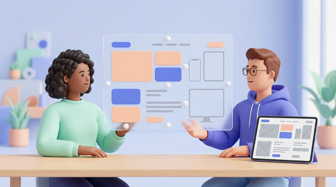
Handoff should not be a final link sent after every decision is locked. Designers and developers should discuss feasibility, data, components, responsiveness, accessibility, and edge cases throughout the work.
A practical handoff may include:
- Organized and approved flows
- Reusable components and their states
- Variables or design tokens
- Responsive rules and breakpoints
- Interaction and motion notes
- Real content, limits, and fallback behavior
- Loading, empty, error, success, and permission states
- Exportable assets
- Accessibility expectations
- Acceptance criteria and unresolved questions
Not every repeated screen needs a unique polished mockup. One clear component rule can communicate twenty similar cases more reliably. Unique, risky, or exception-heavy flows need more detail.
A design is ready when product, design, and engineering agree that its requirements, behavior, states, and implementation detail are clear enough to build and test. It does not need to be immune to change.
Figma describes how its teams use Dev Mode and variables to connect design systems with implementation. The tool helps, but direct conversation and shared ownership remain essential.
Step 11 — Review the build and learn after launch
Review production throughout development rather than waiting for a final visual inspection. Check behavior, content, responsiveness, accessibility, performance, and system consistency—not only pixel differences.
When engineering changes the design for a valid reason, record the decision and update the source component or flow. Otherwise, the design file becomes outdated and future work repeats the mismatch.
After launch, compare evidence with the outcome agreed at the start. Review analytics, support issues, usability sessions, interviews, and product feedback. Add confirmed problems and opportunities to an iteration backlog.
The UI/UX design process does not finish when files are handed over. A shipped interface creates new evidence that prototypes could not provide.
How the UI/UX design process changes for a lean startup
A startup can reduce depth without skipping the thinking. A lean MVP workflow might include:
- One focused alignment workshop
- Existing evidence plus a few relevant user conversations
- One primary role and high-value task
- A core flow and state map
- A low-fidelity prototype
- A small usability test
- A starter component system
- Direct designer–developer collaboration
- Post-launch measurement
This is not a lower-quality process. It is a narrower one. The team deliberately addresses the largest risks first and postpones work that the MVP does not need.
Increase the depth when a wrong decision could harm health, money, privacy, accessibility, compliance, or a complex business operation. More roles, platforms, integrations, and legacy constraints also require stronger documentation and testing.
For a practical tool stack that supports research through handoff, see UX tools for startups. If the team is choosing its main design platform, the Figma vs Adobe XD guide explains the current decision.
Common process mistakes that create expensive rework
- Starting polished UI before agreeing on the problem
- Treating a feature list as complete requirements
- Waiting until handoff to involve engineering
- Designing only the happy path
- Keeping placeholder content until the end
- Asking stakeholders what they prefer instead of evaluating the goal
- Testing only with coworkers
- Treating a prototype as production behavior
- Building an oversized system for an untested MVP
- Sending screens without states or acceptance criteria
- Ignoring the implemented product until final QA
- Failing to update design files after approved development changes
Most of these mistakes do not come from a lack of talent. They happen when a team confuses visible output with resolved decisions.
Frequently asked questions
What is the UI/UX design process for a SaaS product?
It usually covers alignment, discovery, problem definition, roles and requirements, task flows, information architecture, wireframes, prototypes, testing, visual UI, a component system, developer collaboration, production review, and post-launch improvement.
How does a UX designer go from requirements to final design?
The designer clarifies the outcome and constraints, researches important unknowns, maps tasks and states, explores options, creates wireframes and prototypes, tests risky decisions, and builds the final interface and system with engineering input.
Should requirements or wireframes come first?
Initial requirements should define the problem, outcome, rules, and constraints. Wireframes then expose missing details, so requirements and the proposed solution are refined together.
Are wireframes enough for developer handoff?
Usually not. Developers also need behavior, system states, content rules, responsive logic, accessibility expectations, assets, component guidance, and acceptance criteria.
Does every screen need a high-fidelity design?
No. Reusable components and documented rules can cover repeated patterns. Unique, risky, and exception-heavy flows need enough detail to remove ambiguity.
How do you know a design is ready for development?
Relevant product, design, and engineering owners agree that the flow, requirements, behavior, states, and implementation details are clear enough to build and test.
Is the UX process linear?
No. Research, testing, technical review, and production work regularly reveal information that sends the team back to an earlier decision.
Final recommendation
The UI/UX design process is not paperwork around interface design. It is how a team turns uncertainty into decisions before paying to build them.
Use the smallest process that resolves the project’s important risks. Align on the outcome, investigate what matters, test uncertain flows, include engineering early, and review the real product after handoff.
If your SaaS team has messy requirements or needs clear flows, tested interfaces, reusable components, and practical developer guidance, explore Imdshakil’s SaaS Application Design service or discuss the project.

