


A SaaS brand identity should make the website, product, sales deck, emails, documentation, and support feel like parts of the same company. Too often, each touchpoint looks polished alone but unrelated beside the others.
The problem is rarely a missing logo. One team uses enterprise language, another sounds playful, and the app shows technical errors. Marketing and product may even use the same color for actions, success, warnings, and links.
Useful brand guidelines connect positioning, messaging, voice, visual identity, product expression, examples, assets, and ownership. They create enough consistency to build recognition without forcing every screen or channel to look identical.
This guide explains how to create a practical SaaS brand identity, starting with a lean startup foundation and expanding only when the business needs more control.
SaaS brand identity: the quick framework
A usable brand system answers seven connected questions:
| Layer | Main question | Useful output |
|---|---|---|
| Positioning | Who is this for, and why choose it? | Audience, category, promise, differentiation |
| Messaging | What should people understand and remember? | Value proposition, message hierarchy, proof |
| Voice | How should the company sound? | Voice traits, tone rules, examples |
| Visual identity | How should it be recognized? | Logo, color, typography, imagery, motion |
| Product expression | How does the brand live in the software? | Product principles, UI color roles, microcopy |
| Applications | How should teams apply it? | Website, deck, email, social, product examples |
| Governance | Where is the current truth? | Owners, source files, versions, review cycle |

So, why does a SaaS company need brand guidelines? They reduce repeated decisions, help teams and partners work faster, make the company easier to recognize, and keep the promise made in marketing connected to the experience inside the product.
A guide works only when people can find and apply it. A beautiful document hidden in an old folder creates no consistency.
Brand strategy, identity, guidelines, and design systems are different
These terms overlap, but they do different work.
Brand strategy defines the audience, market, positioning, promise, personality, and reason the company should matter.
Brand identity expresses that strategy through language, visuals, and recognizable behavior. A SaaS brand identity includes more than a logo: messaging, voice, typography, color, imagery, product cues, and repeated experiences all contribute.
Brand guidelines explain how to use that identity across real situations. A brand style guide may focus mainly on visual and verbal rules, while broader guidelines can also cover positioning, product expression, templates, and governance.
A product design system manages reusable interface tokens, components, states, behavior, accessibility, and implementation. It should connect with the brand system without becoming the same document.
Brand guidelines describe how the company should feel and communicate. The design system explains how the interface stays usable and consistent while people complete tasks.
When should a SaaS startup create brand guidelines?
A startup does not need a hundred-page brand book. It needs enough shared direction to avoid rebuilding every website section, pitch slide, and product screen.
Before product-market fit, create a lean foundation: positioning summary, core message, voice traits, logo versions, accessible colors, practical typography, basic imagery direction, and a few useful examples.
At launch, make the website, onboarding, emails, deck, and product basics feel connected. During growth, expand rules for new modules, campaigns, partners, localization, hiring, documentation, and templates.
A rebrand becomes useful when the audience, positioning, product portfolio, or market perception has materially changed. “The visuals feel old” may justify a refresh, but it is not automatically a strategic reason to replace everything.
Fintech, healthcare, security, and enterprise products may need stronger trust, accessibility, and governance foundations earlier.
1. Begin your SaaS brand identity with audience and positioning
Define the priority buyer and user, the category they place you in, the problem they need solved, their desired outcome, the alternatives they consider, and the difference you can credibly defend.
Use customer interviews, sales calls, support themes, win-and-loss notes, product behavior, and competitor research. Internal ambition is not customer evidence.
A starting positioning sentence can be:
> For [priority audience] who need [important outcome], [product] is a [recognizable category] that [credible benefit]. Unlike [main alternative], it [relevant difference].
Treat this as a clarity exercise, not magic copy. Words such as “streamline,” “transform,” “seamless,” and “all-in-one” say little without specific proof. Strong SaaS brand identity work starts with a clear market choice, not a fashionable color palette.
2. Build the SaaS brand identity messaging hierarchy
Create messages that remain consistent while changing depth for the situation:
- One-line value proposition
- Short company description
- Main audience problem and outcome
- Up to three message pillars
- Evidence for each pillar
- Product and module descriptions
- Trust and objection responses
- Preferred call-to-action language
An executive may need business impact and risk. A daily user needs task value. A developer may need technical capability and documentation. These versions can differ without contradicting the central promise.
Evidence matters. Replace “powerful automation” with what is automated, for whom, and what it changes. Use approved proof such as product behavior, customer stories, certifications, or measured results. Do not let the brand promise something the product and support teams cannot deliver.
3. Define voice and tone for SaaS brand identity
Voice is the recognizable personality behind the writing. Tone changes according to context.
Choose useful traits with boundaries:
- Confident, not exaggerated
- Technical, not needlessly complex
- Friendly, not careless
- Direct, not cold
Then show examples. “Something went wrong” is vague. “We could not save this report. Your changes are still here; try again” is calmer and more useful.
Marketing can be energetic, documentation should be precise, and a security notice should be serious. All can sound like the same company.
Include “we say” and “we avoid” examples for headlines, onboarding, errors, support, announcements, and calls to action. Adjectives alone are too open to interpretation. The goal is not to make every writer identical; it is to stop the company from sounding like unrelated personalities across channels.
4. Create a logo system that works at SaaS sizes
A SaaS logo must work on a website and in small spaces such as a favicon, app icon, integration tile, social avatar, and product header.
Provide primary, icon, monochrome, and light- or dark-background versions. Document clear space, minimum size, approved backgrounds, and misuse.
Store downloadable vector and raster exports beside the guidance. Partners should not need to copy a low-resolution logo from the website.
Slack’s official brand terms show how mature brands govern clear space, assets, trademarks, screenshots, and prohibited modifications. A startup can begin more simply: make correct use easier than improvisation.
Do not let logo rules consume most of the guide. Recognition comes from the whole system.
5. Build accessible color systems for SaaS brand identity
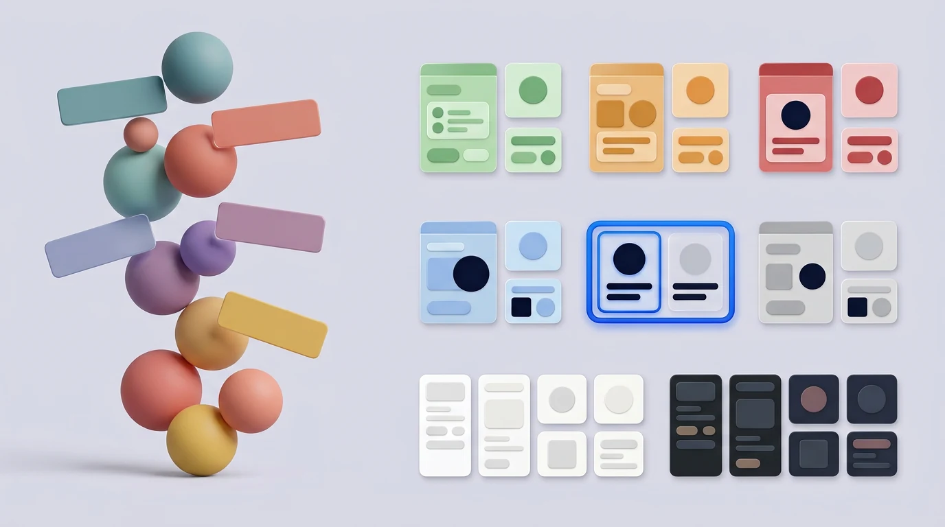
List exact values for primary, secondary, neutral, and accent colors, but do not stop at swatches. Show which combinations work for text, backgrounds, buttons, illustrations, and product surfaces.
Separate expressive brand colors from functional interface roles. The product needs reliable colors for success, warning, error, information, focus, selection, disabled content, borders, surfaces, and text.
If one bright brand green means primary action, success, and a positive chart change, its meaning becomes unclear. If the same color has weak contrast on light backgrounds, consistency starts harming usability.
Document light and dark contexts and pair important color signals with text, shape, or icons. W3C’s WCAG 2.2 reference provides the standards and techniques teams should consult for contrast, non-text content, and other accessibility requirements.
A strong SaaS brand identity supports recognition while leaving enough functional range for an accessible product.
6. Choose typography for expression and utility
Define display, heading, body, label, caption, and product UI styles with weights, line heights, spacing, and responsive behavior. Include fallback fonts and licensing information.
Test typography with real conditions: long headings, dense tables, form labels, large numbers, multilingual content, small screens, and text resizing. A distinctive display face may suit marketing but become tiring in documentation or product controls.
Check character coverage, numeral clarity, loading performance, and availability across web, mobile, slides, and documents. If most employees cannot access the chosen font, every internal deck will drift.
One flexible family or a practical pairing is usually enough for a young SaaS company. More font files create more choices, slower pages, and harder governance.
7. Define imagery, illustration, icons, and motion
For photography, document subjects, settings, composition, lighting, editing, diversity, and what feels off-brand. Avoid generic stock scenes that could advertise any software company.
For illustration, define geometry, line, depth, texture, color use, character treatment, and complexity. For icons, choose a family and explain size, stroke, fill, and when a label is still required.
Product screenshots need rules for cropping, sample data, privacy, browser or device framing, backgrounds, and annotations. Use believable data without exposing customer information.
Motion guidance should explain purpose and character, not only duration. Motion can show cause, hierarchy, and progress. Provide reduced-motion alternatives.
Also set AI imagery rules. Decide acceptable uses, review standards, privacy limits, rights checks, consistency expectations, and sensitive contexts where generated visuals are inappropriate. “Use AI when convenient” is not enough governance.
8. Connect SaaS brand identity across marketing and product
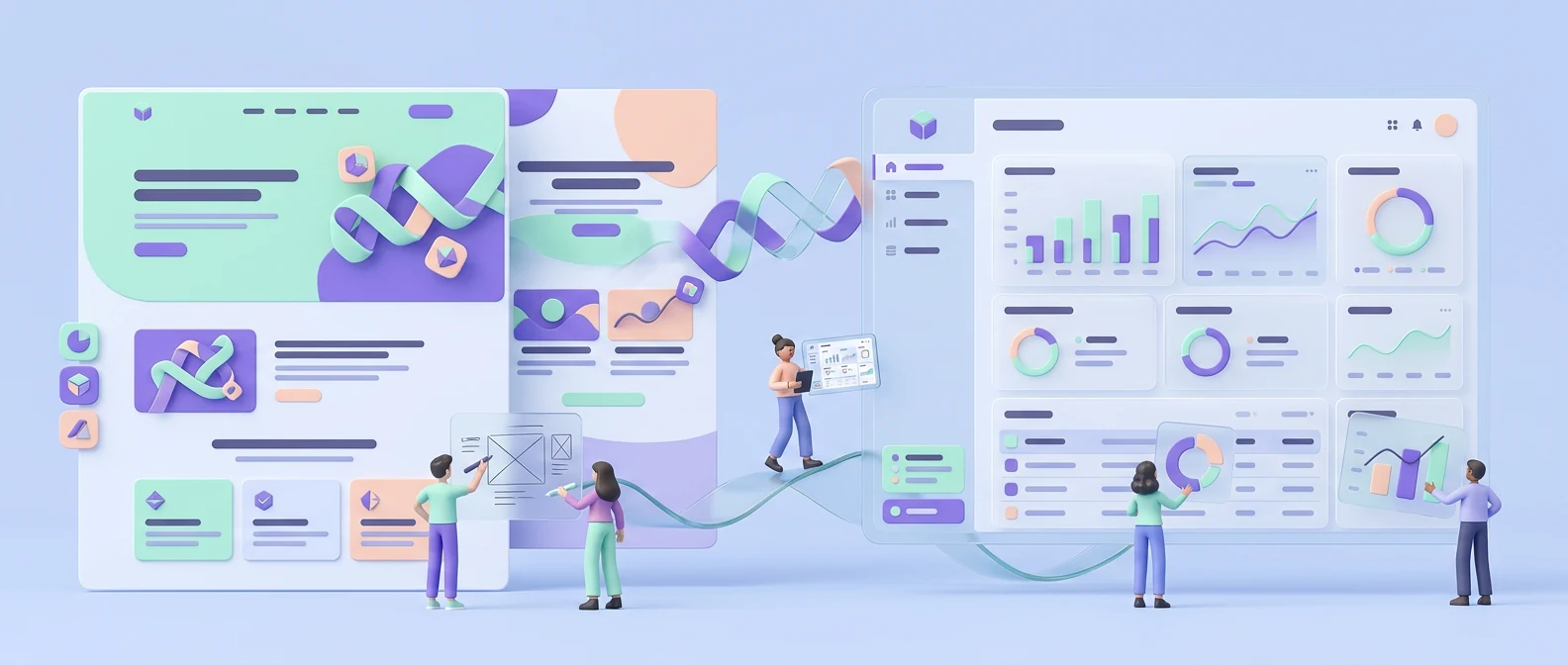
The marketing site and software should feel related, but they have different jobs. Marketing explains and persuades. The product helps people complete tasks repeatedly.
Connect them through a shared color family, typography, icon geometry, illustration cues, voice, terminology, and design principles. Do not force dramatic marketing layouts, decorative effects, or oversized typography into dense operational screens.
Platform conventions also matter. An iOS app, Android app, web dashboard, and documentation site can express the same brand while respecting different interaction needs.
When products serve different users, consistency should not force one layout everywhere. Keep foundations and shared concepts recognizable, then adapt information architecture, density, and components to the job.
The SaaS product design guide explains how workflows, states, and systems support the product experience. Brand and product teams should work together rather than handing finished rules across a wall.
9. Show real applications, not only rules
Abstract principles become useful when people can see them applied. Include examples for the touchpoints the team actually creates:
- Website hero and feature page
- Pricing or conversion section
- Product onboarding
- Empty and error states
- Product screenshots
- Documentation
- Sales deck
- Social post or advertisement
- Partner placement
Show correct and incorrect use where confusion is likely. Templates for repeated work can save more time than another page of adjectives.
Use realistic content and difficult examples, not only ideal headlines and short names. The guide should help a marketer create tomorrow’s campaign and a product designer write an error state—not only explain the launch concept.
10. Govern SaaS brand identity through one source of truth

A PDF is useful for sharing or archiving but risky when its status is unclear. A website, Figma file, Notion workspace, or brand platform can be easier to update. Choose what the team will maintain.
Keep one official location for current guidance and downloadable assets. Link out to product components, source files, templates, and legal notes instead of copying old versions into several folders.
Name owners for positioning, messaging, visual identity, product expression, and final approvals. Add a version date, change log, archive process, and review rhythm. Give partners access only to the guidance and assets they need.
Small teams rarely need an enterprise portal. They need a clear, owned hub. Growth in permissions, localization, sub-brands, and assets may later justify stronger tooling.
Good governance protects SaaS brand identity without requiring approval for every routine task. Define where teams can adapt and when review is necessary.
Lean SaaS brand guidelines for an early startup
If you are asking how do I create brand guidelines for my SaaS startup, begin with this compact kit:
- Positioning summary: audience, category, problem, promise, difference
- Messaging: one-line value proposition, short description, and proof pillars
- Voice: three traits with “we say / we avoid” examples
- Logo: primary, icon, monochrome, light/dark use, and basic misuse
- Color: small accessible brand and functional palette
- Typography: one family or practical pairing with fallbacks
- Imagery and icons: a clear direction with a few examples
- Applications: website, deck, social, and product examples
- Assets: one approved location for source files and templates
- Governance: one owner, version date, and next review
This is enough to reduce common decisions and create a consistent launch. Add extensive sub-brand architecture, dozens of templates, complex motion, partner systems, and enterprise approvals only when real work requires them.
Early guidelines should be easy to change. Product-market learning may alter the audience or message. Build a firm enough base to look credible without treating every early decision as permanent.
Brand guidelines SaaS checklist
Use this brand guidelines SaaS audit before publishing or updating the guide:
Strategy and language
- Priority audience and category are clear
- Positioning and differentiation are believable
- Value proposition and message hierarchy exist
- Claims connect to approved proof
- Voice traits include examples and boundaries
- Tone changes are shown for key contexts
- Product names and shared terms are consistent
Visual identity
- Logo versions, clear space, size, backgrounds, and misuse are covered
- Current vector and raster files are downloadable
- Brand, neutral, and semantic product colors are separated
- Approved color combinations meet accessibility needs
- Typography includes hierarchy, fallback, licensing, and language support
- Photography, illustration, icon, screenshot, and motion rules are usable
- AI-generated asset rules are documented
Product and applications
- Marketing and product relationships are explained
- Usability and platform conventions may override visual sameness
- Website, product, deck, email, social, and documentation examples exist where relevant
- Templates reflect current work
- Accessibility and localization are addressed
Governance
- One current source of truth exists
- Each area has an owner
- Version history and archived assets are clear
- Partners can find approved materials
- The guide has a review date and change process
Common mistakes in SaaS brand guidelines
- Starting with logo and color before positioning
- Copying the usual blue-gradient SaaS look without a reason
- Defining personality with adjectives but no examples
- Listing color values without explaining use
- Ignoring product UI, states, and microcopy
- Making unrelated products use identical layouts
- Using inaccessible brand colors for functional states
- Showing applications the team never produces
- Publishing a PDF without current source assets
- Failing to assign an owner
- Treating consistency as more important than clarity
- Building an enterprise brand book before product-market fit
Consistency does not mean sameness. It means repeated choices are intentional, recognizable, and appropriate to their context.
Frequently asked questions
Why does a SaaS company need brand guidelines?
Guidelines help marketing, product, sales, support, partners, and contractors make faster and more consistent decisions. They connect the company’s promise, voice, visuals, and product experience.
How do I create brand guidelines for my SaaS startup?
Define the audience and positioning first. Then document messaging, voice, logo, color, typography, imagery, product expression, useful templates, source assets, and ownership. Start lean and expand with real needs.
What should a SaaS brand style guide include?
A useful brand style guide covers strategy, messaging, voice, logo, color, typography, imagery, icons, motion, product relationships, templates, and governance.
Are brand guidelines and a design system the same?
No. Brand guidelines govern identity and expression across touchpoints. A design system governs reusable product UI, behavior, accessibility, tokens, components, and implementation.
Should every SaaS product use the same layout?
No. Keep shared foundations and patterns where useful, but adapt layouts, density, navigation, and components to different users, platforms, and tasks.
Do startups need a large brand book?
Usually not. A compact guide with clear direction, real examples, current templates, and approved assets is more valuable than a large document nobody uses.
How often should brand guidelines be updated?
Update them when approved strategy or identity changes, and schedule reviews as the product, market, team, and channels grow.
Final recommendation
A useful SaaS brand identity turns strategy into repeatable decisions across marketing and product. Begin with audience and positioning, create a clear verbal and visual system, show real applications, and maintain one source of truth.
Start lean. Expand only when new products, channels, partners, or markets create real complexity. Consistency should make the company recognizable, not make every experience identical.
If your team needs help connecting SaaS positioning, brand guidelines, web design, product UI, and design-system foundations, explore Imdshakil’s branding and design services or discuss your project.

