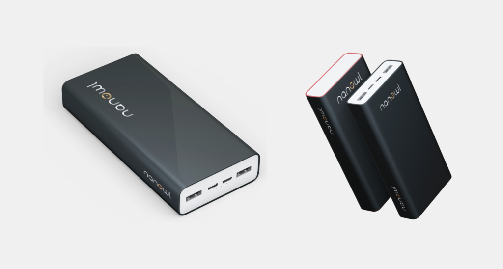
Firstly my product is a magnetic wireless power bank. One pf the things that differentiate me from the rest is the design: it is sleek, luxurious, and premium.
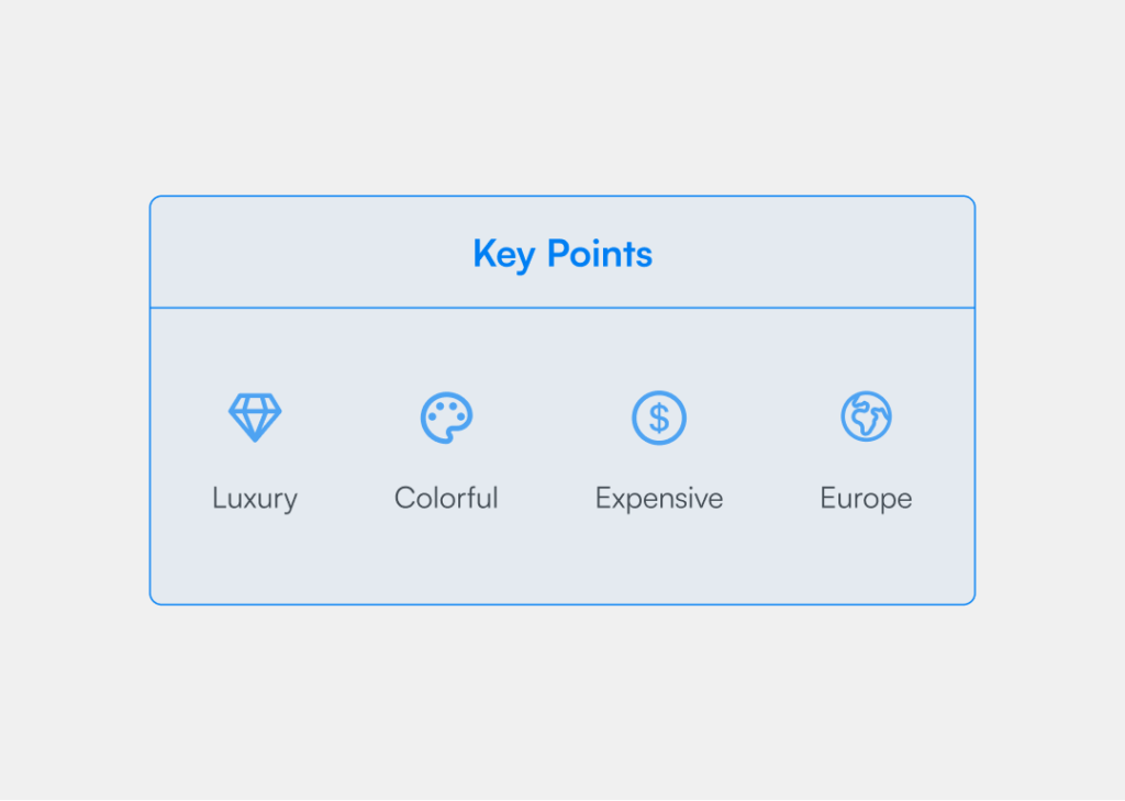
The goal is to give a premium feeling and experience to the customers. Imagine the brand RITUALS, their color choice is perfect. Their gold logo reflects the premium feeling. Besides that, they use premium packaging with beautiful colors. They follow a certain theme depending on the scent.
The targeted audiences
Youth male and female
Long-time mobile phone user
Lives in Northern Europe countries
Maybe travelers will be a big audiences
Users should afford the expensive gadgets
User's need
Make the product flexible and easy to use
Keep everything simple and understandable
Make a look like a premium quality product
Try to keep the color eye comfortable
Involve 3D vibes in each element
Try to choose luxury writing
Human Psychology
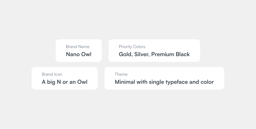
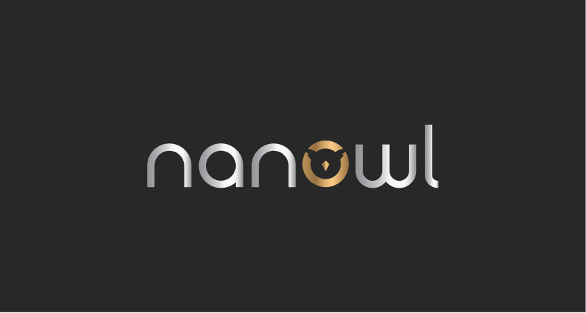
The nano owl can be a luxury brand. So we need to determine the user as a premium product user. Sometimes I need to change some basic things like Co-Expensive products and usability. Any time you can get the user’s attention by using similarities with other trusted and popular brand designs and concepts. So that, users can relate to the product easily. That’s why our main challenge will be to make something new with related brands and determine the user’s attention. So now we need to get some solutions for this brand and choose the right things for users.
Generate Idea
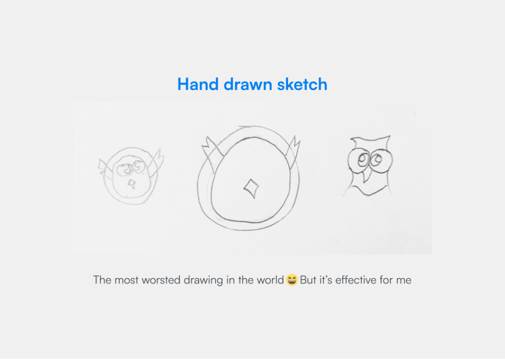
In this case, I will give the priority to the favicon or main logo icon. So basically I’m trying to make an iconographic logo where I will use an icon and the brand name. So let’s start will the icon. Meanwhile, I’m going to make an owl as a circle then let’s see the band name “NANO OWL”. See there is 2 O between nano and owl. So let’s try to remove these 2 O and make a simple owl circle. So that the logo will be a little bit shorter. And also keep in mind the Nano shapes.
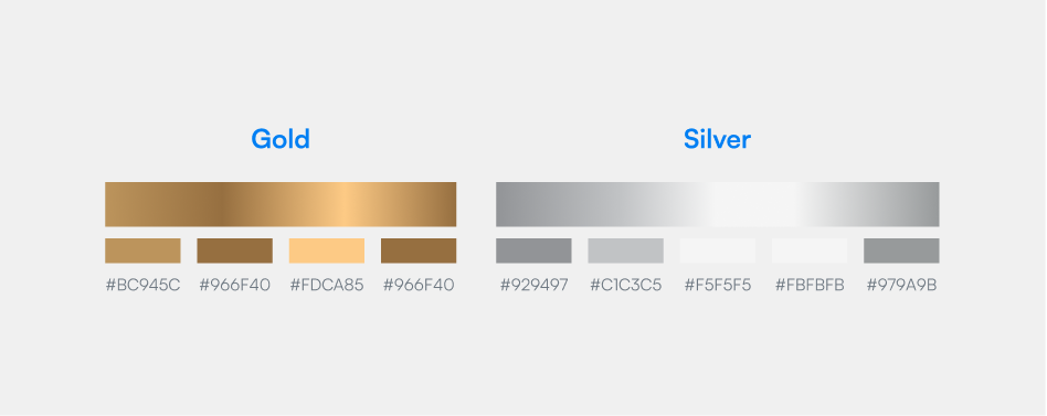
Color Selection
Now let’s talk about the color scheme. We have to choose a great color palette that will look like 3D and realistic. We have 2 options to use as the main color. So if you choose gold or silver color then we have to very the visibility and color contrast. We have to fit this component in any color section. So, We can use a midline color which will be the middle of the dark and bright selection and that will be perfect for this logo. Let’s choose 2 colors of gold and silver and test them over the different color backgrounds. So here are my chosen colors.
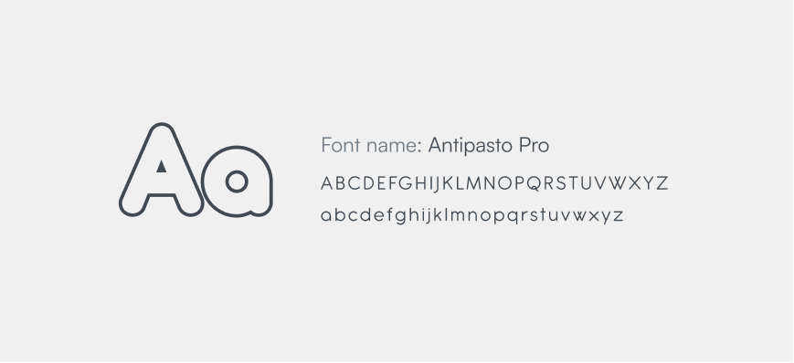
Typography Selection
Now we are going to define the typeface of this logo. Let’s think about NANO and OWL. If you make all characters as small letters then how will look like it? I have already tasted it a lot with using general text, all caps, and small types and I found the small letter will be the best for this text. Now it’s time to choose the font family. Already we have used the icon as a circle. So we need the font like something circular or rounded. I have seen the rounded text and circular font. But finally, we decided on the circular font for the nano and owl types. I preferred him to use just one font on this logo and he agreed with me. So, we have chosen this font. The type details are here.
Final Result
Design Success note
It’s time to note our design success. Let’s see what we have done on this task.
We have kept the design simple and elegant
This design looks more premium
We have added the 2 luxury colors
We have successfully made the favicon or Owl icon according to font style
In every design, I have to choose a dark background for this logo. Cause here we have to use the silver color and silver color is a low contrast color scheme.